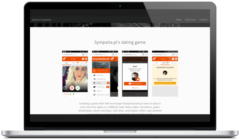
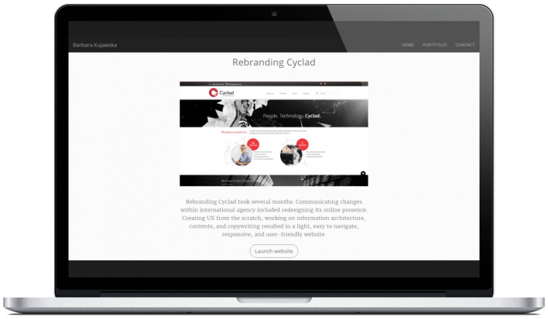
The basic idea of my portfolio is to show the most interesting projects I was involved in. Each one of the 6 I picked must present different set of skills: designing UX, UI, and, last but not least, front-end development. That's why I couldn't imagine myself using a ready-made portfolio template. I had to create something on my own.
Saying NO is easy
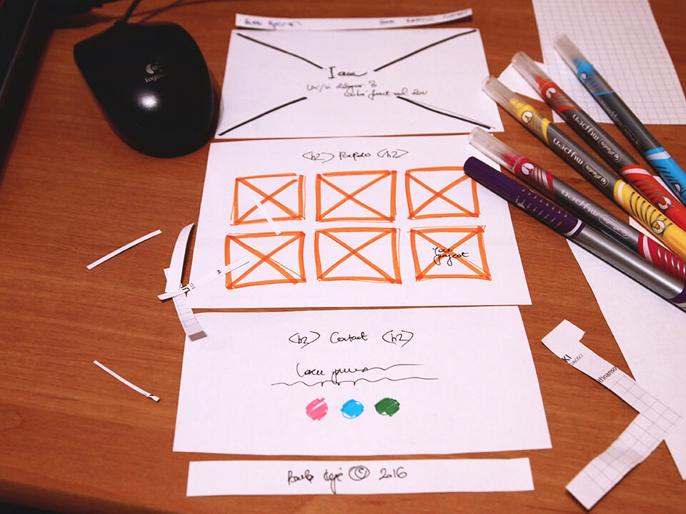
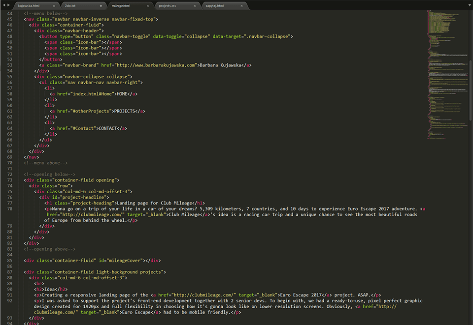
I really enjoy coding. Therefore, my portfolio became kind of a playground, where I like to test new ideas. Long before that, however, I had designed (and cut in paper like crazy!) a basic wireframe of what the end result should look like.
The first impression is made by a hero image extending over the entire height of a viewport. Down below thumbnails representing my projects and leading to appropriate subpages. Obviously, the last section includes contact details.
That's it.
Of course, beta version looked quite differently. Before I managed to create contents for all 6 subpages, my portfolio had been a single (loooong and single) page.
Black is the new white
I decided that in order to stand out from the crowd of other UX portfolios, I won't use light and optimistic color scheme. Instead, I'll stay with dark palette and add some contrasts. Just the way I like it.
In order to save time, 6 subpages with project descriptions have been coded using only 1 generic template. As majority of my visitors have probably seen or do have access to my résumé, I deliberately omitted personal data section and other detailed bits of information about me.
Grabbing the toolbox
Of course, from the very beginning I took care of responsiveness. My portfolio has been developed as RWD website.